Tuesday, 18 October 2011

2nd Assignment


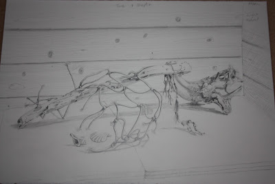
I have chosen objects for my 2nd assignment that mean something to me.  The driftwood, fish netting and shells were all collected by my family this year on holiday in North Devon where we went to celebrate my birthday.  I have used the birthday card made by my youngest Granddaughter. I love this piece of driftwood it is such a great shape.  I started to think about composition and what media I would use.  I have chosen coloured pencils as I feel I am getting to grips with them. 
I also played about with colour and made notes of the colours I used.  The practise piece I decided to do in soft pastel on pastelmat as I feel more at home with them. I also chose some flowers from the garden and put them in a glass vase to include into the picture.
I felt after looking at the finished practise piece that there was a lot of space on the right hand side and that it just looked uncomfortable so at the eleventh hour I decided to put the birthday card on the wall and a coffee mug to the right of the netting and I think that it improves the composition.

The main problem I found with this drawing was not to loose any depth particularly on the driftwood in the foreground.  I wanted to maintain the light and the darks and did not want two areas of similar tone to fight against each other.  The netting was tricky as the drawing of the netting was complicated and following the net and the knots was laborious but I wanted to achieve the sense for the netting going towards the background with the piece of drift wood.  I have kept the table foreground simple as so much is going on elsewhere I didn't want to loose anything in being over fussy with it.

Drawing animals

Having chosen to draw my friends cat which is a 14yr old half Siamese and half Devonshire Rex called Boris.  Thinking being an old cat he would be less active and easier to draw which was a big misapprehension as he was as lively as a kitten.  His fur was difficult to draw as he doesn't moult and the fur is curly and wool like except for his face and tail which is smooth and short haired.  It lies in tufted lines and is extremely textural. He is bald on his abdomen and the skin lies in folds. His ears and eyes look too big for his face and he is a very unusual cat in looks and personality.  I firstly drew him in pencil to get the feel of his shape and didn't realise how hard this was going to be as he was so interested in what I was doing he was continually moving about.
The only way I found to capture a pose was to go for a basic shape quickly as you cannot worry about accuracy and I think I managed some poses in this way.
The next time I visited Boris I wanted to catch him in other poses so I tried with conte crayon and again it was difficult to get a consistant pose.
The final picture I did of Boris is in charcoal and I think that I have captured the texture of his coat. Even when he was sleeping he was constantly tucking his head in different postitions.  I enjoyed my time with Boris but you have to be patient and be willing to spend time just sitting and then siezing the moment.  I have copied animals from pictures and photographs but you see so much more from life and maybe the picture looks less accurate but I think you are more likely to catch the essence of the animal and not just the image.

The next exercise is a fish on a plate, which was very hard for me as I do not like fish and cannot touch them.  Having bought two herrings and a trout and arranged them on a plate with a help of a fish fearing friend I began to draw and colour them using water colour pencils.  Water colour pencils are quite hard to use and do not react in the same way as water colour paint as it doesn't move around a lot when water is added and if you apply too much water the colour can wash out and runs to the edge of the water line.  This could be useful if you want that effect.  Also colours are stronger when wet some more than others and in this exercise I should have tested this out on paper before I applied the pencil particularly when doing the shadow which is far too heavy.
Another consideration is weather, I work in a shed at the bottom of the garden and it gets hot in the summer and when I started the fish on one day and stored them in the fridge overnight which was fine first thing in the morning but by midday they were putrid.


Drawing animals is rewarding and frought with challenges, I tried to draw some New Forest ponies earlier in the year and found that I was chasing them all around the field.  I only achieved two reasonably sketches but since I have never drawn a horse before I was pleased with that.

Anatomical drawings of George Stubbs

A Brief History of George Stubbs


                                    A Self Portait of George Stubbs
                    http://www.bridgemaneducation.com/Search.aspx
George Stubbs was born in 1724 in Liverpool and he was the son of a currier.  He had little formal training in art although he was briefly a pupil of Sir Godfrey Kneller's assistant Hamlet Winstanley.  This training was enough to set himself up as a portrait painter where he worked in Wigan.  He was very interested in human anatomyand studied at the York County Hospital and he know enough about anatomy to give private lessons to medical students.  In 1751 he was comissioned to illustrate a book on midwifery by Dr John Burton.
In 1754 he went to Rome to reaffirm that his belief that nature was superior to art and although he did have a great liking of Italian art when he died some Italian works were found in his collection.  Whilst in Italy he became intrigued by the marble horse attacked by a lion in the courtyard of the Palazzo Senatorio in Rome. The author suggests that this is where his several paintings on this theme originated.

                         A Lion Attacking a Horse (oil on canvas) 1762
                       http://www.bridgemaneducation.com/Search.aspx
In 1756 he fathers a son George Townley Stubbs by Mary Spencer his common-law wife.  In 1750 the Jockey Club was and the breeding and training of racehorses became fashionable.  So in 17 58 Stubbs began to study the anatomy of horses in a farm house in Horkstow near Lincolnshire.  He used dead and decaying horses to disect and reconstruct skeletons in his quest to understand the anatomy more thoroughly.  He did all his own engravings for a book  called simply the Anatomy of the Horse and this enabled him to produce paintings of unsurpassed accuracy far exceeding his predessors James Seymour or John Wootton.
 Stubbs by William Gaunt Phaidon Press Limited 1977


Diagram from the Anatomy of the Horse
Whistlejacket was his most famous work and changes convention by having a plain background

                                   Whistlejacket 1762 (oil on canvas)
George Stubbs also painted exotic animals such as giraffs, lions, monkeys, tigers and rhinoceroses which he observed from private menageries.  He died at the age of 81 yrs on 10th July 1806
                           http://en.wikipedia.org/wiki/George_Stubbs
Stubbs's contribution througj the Anatomy of the Horse was an important piece of research and was vital to the understanding of the stucture of the horse.  The knowledge of  skeletal and muscle placing defines the shape of the horse.  The horse's coat in his paintings is short so the muscle and skeletal definition show through and the accuracy of his work is unchallenged.  He also added individualism to his horses as they all seem to have different expressions such as in the Mares and Foals painting


Mares and Foals without a background 1762
The most expensive Stubbs painting recently sold was Gimcrack on Newmarket Heath with a Trainer and Stable Lad and a Jockey  at Christies International in London on July 5th 2011 http://en.wikipedia.org/wiki/George_Stubbs


The Animal Drawings of Albrecht Durer and Leonardo da Vinci

I was asked to look at the drawings of animals of two masters and so I have chosen Durer and Da Vinci as I have already some previous research on these two artists I didn't focus on their animal drawings so I thought I would look into their work on animals.
Albrecht Durer
The Hare water colour on paper 1502
http://www.bridgemaneducation.com/ImageView.aspx?result=0&balid=311216
The Hare is a most precise drawing of an animal which is not surprising given Durers interest in proportion and anatomy.  The hare's coat is so real and the painstaking patience to paint and draw this animal is amazing.
Three studies of a Bull Finch water colour with gouache on paper.
http://www.bridgemaneducation.com/ImageView.aspx?result=0&balid=311216
 I chose the birds because of thedifficulties of drawing these creatures and getting the posture right.  They may have been caged so that it would make it easier to draw and of course keep them in one place.

Leonardo Da Vinci
Leonardo was said to have loved animals and according to this website he wrote 'The time will come when men such as I will look upon the murder of animals as they look upon the murder of men' http://petlvr.com/blog/2006/12/13/leonardo-da-vinci-leonardos-animals-part-1-of-2/
Rider on Rearing Horse http://www.bridgemaneducation.com/ImageView.aspx?result=0&balid=311216

This picture has such movement and it is all about the horse and not the rider.  The angry temperment of the horse is evident and the back legs have been skeletally exagerated, which makes me think that Leonardo has a very good grasp of the horse's anatomy and he can play about with the animal with out it looking out of context.


Study of Cats
Having just spent two days drawing cats I was delighted to find this drawing of Leonardo cats.  I love the poses and appreciate how difficult it is draw a restless animal.  He has them prowling and playing and he also has one with an elongated neck which looks dragon like, so he was playing around with their form and movement.

Drawing Plants and Flowers

The first exercise in this section was to draw a plant in negative relief and I really enjoyed this exercise, it was almost a eureka moment, so much fell into place about the problems of drawing following this exercise.  I found as I was doing this work when it was going slightly awry it was because I had lost focus on the negative space and reverted back to drawing the positive areas.  I then was able to bring it back by focusing on the negative space and this was simplifying the task.
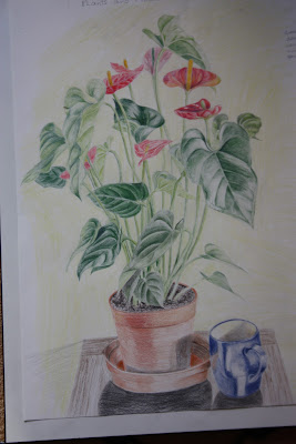
The following task was to draw and colour a plant in coloured pencil and so far my experiences with coloured pencil have been not very satisfactory.  I chose a plant, an anthurium, and  decided to concentrate on bringing out the tone of the leaves as this is a major part of this plant. I had to plan the colours before I started as once they are put on to paper they are not easily removed.  It was a very time consuming medium and a lot of time is spent building up the strength of the colour.  The negative space in this project is important as there are a lot of interesting shapes between the stems and leaves.  I noticed that the veins of the leaves didn't end at the edge of the leaves but joined together at the outer aspects of the leaf.  The flowers were all different in tone and colour because of the various stages of their growth.  I firstly worked out the verticals and the width of the project and then worked out the proportions.  I then worked leaf by leaf and insuring that the stems followed down to the pot. I also concentrated very much on their shape and the tone to give them a more three dimensional look.
Words echoed in my ear from my tutor 'every line should mean something'.
      

The next drawing is of the same compostion using mixed media which was fun and more liberating and again I feel I could have gone further with this and just enjoyed making it more messy.

Ben Nicholson

I have been asked to discover why Ben Nicholson simplifies still life forms and negative space and superimposes them on the Cornish landscapes.

Ben Nicholson a Brief Life History

Ben Nicholson was the pioneer of geometric abstract paintings and reliefs that had a direct impact on the International Abstract Movement.
Nicholson was born on  April 10th 1894 in Denham he was the son of William Nicholson a painter and sculptor and his mother Mabel Pryde was also an artist.  He was only at the Slade School of Art for a short time and was dissatisfied with the formal training and wanted to find his own way.  He began work at Slade with cups, jugs, mugs and bottles and these were to feature in his later works. http://www.encyclopedia.com/topic/Ben_Nicholson.aspx
In 1904 He met JM Barrie and a picture by Ben Nicholson was used on the poster for the play Peter Pan and his father designed some of the sets and costumes.  His first marriage was to Winifred Roberts on 5th November 1920 they had three children.  They were later divorced in 1938.  He then married fellow artist Barbara Hepworth in 1938 and had triplets two daughters and a son and he then divorced in 1951. He finally married a german photographer Felicitas Voglar in 1957 and this also ended in divorce in 1977.
In 1924 his interest in Cubism increased and this was to influence his subsequent work throughout his life.  His works during the 1920's were simplistic landscapes painted in Ticino Switzerland, Cumberland and Cornwall where he first visited in 1928.  By the end of the decade Nicholson led a small group of artists identified with the Seven and Five Society.
http://en.wikipedia.org/wiki/Ben_Nicholson
The Seven and Five Society was founded in London in 1919. Initially it was a post war conservative group of artists promoting return to order.  The first exhibition was not formed to pioneer new 'isms'.  Ben Nicholson joined in 1924 followed by other modernists including Dame Barbara Hepworth, Henry Moore and John Piper.  They virtually took over the group and renamed it the Seven and Five Abstract Group.
http://www.tate.org.uk/collections/glossary/definition.jsp?entryId=270
During the early 1930's modern art was mostly throught of by references to pre WW1 international development art groups.  Nicholson visited Paris and made aquaintances with Joan Miro, Piet Mondrian and Hans Arp.  These aquaintances coincided with a departure from landscape painting to a more geometrical abstract theme using flat space in relief.  He experimented and produced his first abstract relief in December 1933, followed by his first series of carved and white painted reliefs which gave him modernistic recognition.
http://www.nationalgalleries.org/collection/online_az/4:322/result/0/734?initial=N&artistId=3627&artistName=Ben%20Nicholson&submit=1 This link shows an example of his new style of work.
In 1937 he co-edited the Circle (international survey of constructive art)
In 1943 he settled in St Ives and he began to reintroduce landscapes to his work with geometric shapes in the foreground combining two concepts.  His reputation in St Ives was significant.
By the 1950's his international status was recognised and he was awarded the The Guggenheim International Painting Prize and the Prize for Painting at the Sao Paulo Biennale in 1957. He produced may large painting which combined landscape with abstract relief.
http://www.moma.org/collection/browse_results.php?criteria=O%3AAD%3AE%3A4293&page_number=&template_id=6&sort_order=1#bio
I think that Nicholson's interest in cubism and his own interpretation of his geometric shapes meant that he had to continue along this path.  The fact that he moved to Cornwall to be surrounded by beautiful countryside  and the combination of the two it had to be the only marriage that truely worked for him.

Drawing Fruit and Vegetables in Colour

The next exercise requested drawing some individual fruits and vegetables in colour using cross hatching.  This was again tricky as it was quite hard to get the tones right as all fruits and vegetables are either curved, lumpy, irregular and have textured surfaces. I try to use natural light but sometimes on a dull day it doesn't help determining the tone.  I chose to use coloured pencils but found that it was difficult to build up tone and I think that I should have put on more areas on colour to give more depth to them.
The second part of the exercise was to arrange a group still life and again use hatching as a technique to indicate tone.  I again chose to use colour pencils but the same problem occured that the tones were not deep enough.  It isn't the type of medium used but the fact that I didn't work into the tones enough.
The next exercise was setting up a group on still life using felt tips dipping pens and coloured inks.  This was much bolder and more immediate I enjoyed the freedom of making a decision and with inks you have to live with it, I should have experiemented more and used splattering.

The last exercise in this section was the use of oil pastels which I found to be very difficult.  The exercise was to cross hatch the colour on in layers allowing some paper to show through.  The oil pastels I used were sennelier pastels which are very soft and as I was doing this exercise during some of our hottest days I was struggling with controlling the medium as it was melting in the heat, I resorted to putting them in the freezer so that I could get some control.  I think that this medium for me had to be the most challenging.  Fruit and vegetables are great subjects to draw owing to their different textures and shape and state of ripeness alters colours and tone.  The difficulty I found with oil pastels is the difficulty of getting detail with this medium and perhaps I shouldn't have strived to achieve detail and left it more freer.


Project Still Life using Line

This is another exercise I feel I got a lot out of.  I sat over the basket of vegetables so that I had more of an ariel view.  I had to draw looking down into the basket and I think that I have achieved that aspect of the drawing. I also tried to be aware of the pattern of the tiles on the floor as the tiles that I was looking directly down onto were square but the ones which were further away slightly more elongated, as with an elipse.  I don't think I achieved the effect very well but at least it was a consideration and one I will continue to work on.  The grouping of the objects worked well and I think that placing the objects infront and behind one another creates depth. The texture on the marrow and the cabbage works well, the onion skin which was pealing off not so well. 

Still Life Group in Tone

This was for me a difficult exercise but a valuable one.  I was asked to set up a still life and with different colours pick out the light, mid and dark tones and I do not think I made a very good job of this exercise. It was hard to determine the mid tones as often the mid tones had shades of tone as opposed to the obvious light and dark.  In hindsight I think that I should have used coloured inks so that I had to choose more decisively the tonal differences.


Line Drawing, Tone and Depth and Stipples and Dots

I used a dipping pen to do a contiuous line drawing of some fruit and vegetables.  After trying a pepper cut in half I decided to try other objects.  It was a lot harder than I had anticipated and getting the shape trying to use a continuous line was quite difficult. The space is quite startling when there is no tone and using line to give shape and form is challenging.  I really liked this exercise, it highlighted the faults in observation as there was no where to hide no tone to help out with the form. 
Tone and Depth
I chose a beetroot and I enjoyed this exercise and I feel that although I am not completely comfortable with the cross hatching technique it is becoming easier.  I tried to concentrate on the dark tones to get contrast and depth and I found that the cross hatching worked on the more rounded part of the vegetable and hatching worked well on the straight stems.
I then tried to take this exercise further and used a collection of natural objects to try and work the tone with the cross hatching it was time consuming but it was a great exercise in observation and I soon got into the swing of using the hatching technique.
The next exercise was with stipples and dots and I chose a dipping pen.  I like the randomness of the line with this type of pen and also you can alter the amount of ink on the nib to help achieve different tone.  I think that this technique works well for textured bark and plants although, I would try this technique for any piece of work I think it would be time consuming but I am someone who likes to capture detail and so it would work for me.


Monday, 17 October 2011

Albrecht Durer and Pablo Picasso

I have been asked to find two artists that whose work shows a tight and detailed style of drawing and one whose work is of a loose and freer style, so I have chosen Durer and Picasso.  The reason why I chose these two artists to discuss is that both of them had vivid imaginations and were the product of their times and whatever era they were in they would still have achieved great work due to their extraordinary talent which was evident at a young age. 
Albrecht Durer a Brief History

                                            Self Portrait with gloves 1498
                       http://www.bridgemaneducation.com/Search.aspx
Albrecht Durer was born on the 21st May 1471 and was the 3rd child of  Albrecht Durer a goldsmith in Nurenburg.  After a few years in school he started to learn the basics of goldsmithing and drawing from his father and at the age of 15yrs his obvious talent for drawing led him to be apprenticed to Michael Wolgemut the leading artist in Nurenburg at the time.
His apprenticeship complete he took a gap year when he travelled and learned skills from other artists. At the age of 23yrs he was married to Agnes Frey and this was a childless union.
In 1494 to 1495 he travelled to Venice alone to study and  this was to greatly influence his work.  On his return to Nurenburg he opened a workshop and in the begining his woodcuts were his best works and were mostly of a religous theme. He trained himself to use the burin to make engravings and produced numerous relious works and his notariety spread throughout the artistic areas in Europe. In 1495 He began to seriously study mathematics and the theory of art which he applied to his work and experimented with  proportion to produce a better harmony and perspective. His mathematical proportions were influenced by his experiences in Italy and from antiquity.
During the early 1500's he continued his work with proportion and produced an acclaimed engraving of Adam and Eve.
Adam and Eve 1504 Engraving
                       http://www.bridgemaneducation.com/Search.aspx
He continuously studied and devoted his time to mathematical form and drew upon his geometry to achieve his aims. By 1523 he had completed a manuscript on the Treatise on Proportion.  He continued his studies until his death on April the 6th 1528 and his legacy of producing carefully proportions figures worked out by a mathematical formular became widely influencial among subsequent artists.
http://www.encyclopedia.com/topic/Albrecht_Durer.aspx
Although Durer was obscessed with his mathematical formulae his work wasn't rigid or defined he had a vivid imagination that wasn't reliant on copying from nature or other works.  He embraced the gothic style and and EH Gombrich wrote that he proved himself a master of the fantastic and the visionary, a true heir of those Gothic artists. EH Gobrich The Story of Art
Phaidon Press Limited1995.   The fact that a lot of his work was engraving and woodcut this technique had to be well drawn and tight in style and Durer strove for perfection.  Gombrich also wrote that 'Durer had patience which enabled him to draw sketches which made him a born engraver, who never tired of adding detail upon detail to build up a true little world with the compass of his copper plate.'  I think that the Nativity explains this very well it is an incredibly piece of work.

                                        The Nativity Engraving 1504                          http://www.bridgemaneducation.com/Search.aspx
I think that his whole approach to his work was his detail whether it was a fantasy piece or a work copied from nature.

                 The Revelation of St John the Divine or the Apocalypse                      http://www.bridgemaneducation.com/Search.aspx
It is difficult to know when to stop downloading his work as I am so enthralled with them but I have to download his drawing of a human skull which looks so anatomically correct that he has observed the optic nerve aperture in the back of the lt eye socket and has the correct number of teeth albiet some are missing.

              Study of a human skull 1521 (pen and ink and chalk on paper)
                       http://www.bridgemaneducation.com/Search.aspx

Pablo Ruiz Picasso a Brief History

Pablo was born in Malaga on 25th Oct 1881 and was named the lengthy Pablo Diego Jose Franisco de Paula Juan Nempomuceno Maria de los Remedios Cipriano de la Santisime Trinidad Ruiz y Picasso. He is one of the most famous artists of the 20th Century and his work has influenced architecture, fashion, advertising and even has a car named after him.  He is chiefly known for his involvement with the development of the Cubism Movement.
He was the first child of Don Jose Fuiz y Blasco and Maria Picasso y Lopez.  His father was a professor of art at the School of Crafts and when Pablo was 7yrs old he received formal training in art from his father.  By the time he was 13yrs his father is said to have felt that his skills had been surpassed by his son.
In 1895 Picasso was deeply affected by the death of his 7yr old sister of diptheria and the family moved to Barcelona.  Here Pablo was accepted into its School of Fine Art.
At the age of sixteen he set off to Madrid to study at the Royal Academy of Fernando but he quit soon after his enrollment.
In 1900 Picasso made his first trip to Paris then the art captial of Europe where he met Max Jacob a journalist whom with he shared accomodation.  These were hard times and much of Picasso's work was burnt to keep them warm. http://en.wikipedia.org/wiki/Pablo_Picasso
Moving between Spain and France he eventually settled in Paris 1904 where he experimented with different styles. In 1907 Picasso produced Les Demoiselles d'AvignonI a totally new and original style. This can be viewed on the following website.  http://www.moma.org/collection/object.php?object_id=79766 Picasso worked very closely with Georges Braque in the development of Cubism.  http://www.bbc.co.uk/history/historic_figures/picasso_pablo.shtml

In 1918 Pablo married Olga Khohlova a ballerina.  They had child one called Paulo.  Picasso and Khohlova ended in separation due to Picasso's infidelity and they remained legally married until Olga's death in 1955.
Picasso had many mistress during his life and he was married twice and had four children by three women.
Picasso's painting career was divided into periods testament to his ever evolving search for new styles of painting.  1901 -1904 was his blue period which was sombre and an autere expression of his work. This style was said to be influenced by the death of his friend Carlos Casagemas.  His Rose Period followed on until 1906 and this was a more uplifting style with the use of pinks oranges and warmer colours and a change of mood. Many more styles followed such as the African Period, Analytic Cubism, and Surrealism.
Pablo died whilst entertaining friends with his second wife Jaqueline Roque on 8th April 1773 in Mougins.
Pablo Picasso's drawings  are still very popular today and make statements on may peoples walls in the form of prints.  I particularly like his line drawings which are so simple but he still captures the essence of his subject.  I have copied a few and I will put  in the web link so that the original can be also viewed.

My attempt to copy the Dog by Picasso original copy can be viewed on
http://www.allposters.co.uk/-st/Sketches-Studies-Drawings-Picasso-Posters_c96879_.htm

My attempt to copy La Femme by Picasso from the web link
http://www.allposters.co.uk/-st/Sketches-Studies-Drawings-Picasso-Posters_c96879_.htm

My attempt of a copy of the Owl by Picasso link below

http://www.allposters.co.uk/-st/Sketches-Studies-Drawings-Picasso-Posters_c96879_.htm
Although these particular drawings are very simplistic he produced drawings of immense style and complexity I particularly like the pencil on paper drawing of the Matador Luis Miguel Dominguin.
http://www.abcgallery.com/P/picasso/picasso73.html
Picasso was born in a time that allowed the pursuit of modernity and Durer confined to the aspirations of the Church and of the post medievel period and yet he allowed his imagination to flourish and impact on his work. So I think that their individual talents stood out in their own eras, their styles as different as the times they were bought up in.

Colour Media Evaluation

I have taken some time to play about with the colour media and I tried pastels, oil pastels, water colour pencils, fibre tipped pens, coloured inks and coloured pencils.  I enjoyed playing around with the inks as you can use anything to make a mark with.  It works well with linear drawing, stippling and cross hatching comes into its own with ink. You are limited to the type of paper you can use and smooth cartridge seems to be the preference.  Ink is versatile and initially I thought that it was for small detailed work but recently I saw someone using ink on A1 paper using sponges reeds and brushes.  This is something I will have a go at myself in the future.
Oil pastels I found the hardest to use and I used sennelier pastel which are very soft but blend well.  It is like painting with lipsticks and I found that it was very difficult to do detailed work.  I liked the vibrancy of the colour and I enjoyed the blending, this particular make of pastel moves around nicely when there are enough layers on.  The paper I like with pastel is pastelmat and this works well with soft pastels.
Soft pastels, pastel pencils and pastel sticks are very versatile and using the pencils allow detailed work to be done. Large works can be done and you can vary the texture to a soft smooth look to sharp and defined.  Mistakes can be rectified and it does rub out to a degree as the support is quite robust.  The pastels can be layered with different colours underneath.  Problems with pastel is that it rubs off easily and needs to be fixed and the fixative tends to flatten the colours a bit.
Coloured pencil are ideal for detailed work, but preparation in colour choice is essential as once the colour is on the paper it is difficult to lift off.  It is also a very time consuming medium and it is important to know whether to blend or not.
I liked the fibre tipped pens very handy for drawing outside, the line is consistant which is not so interesting as using a dipping pen where you can get more random line.  Good for bold statements and it encourages you to doodle and be freer in mark marking.
Water colour pencils I found quite hard to use.  They are good for out door use and can be used dry or wet.  I found that the colour once wet doesn't move about much so you have to be very careful where you apply it.  It is good for botanical and animal painting and you can go over the top of it and add more colour.

Tuesday, 11 October 2011

Rembrandt Van Rijn and Max Beckmann

Brief Life History

Portrait of Rembrandt Oil on Canvas
Rembrandt was born in Leiden on 15th July 1606. His father was a miller and reasonably well to do.  At the age of 14yrs Rembrandt enrolled at the University of Leiden where he was uninterested in study and left to study art for 3 years with Jacob Van Swanenburgh.  He then spent 6 months with Pieter Lastman and in 1622 opened his own studio which he shared with his collegue and friend Jan Lievens.  Having been discovered by a statesman Constantijn Hygens, he was given important commissions by the court of the Hague and his success was on the ascendence.
In 1631 he moved to Amsterdam where he practised as a professional portraitist and married Saskia Van Ulenburgh a cousin of a successful art dealer.
 In 1639 Rembrandt and his wife moved to a prominent house in the Joden Breestraat and today it is a museum.  The purchasing of this house was partly the cause of his financial problems which plagued him throughout his life.  He lived way beyond his means and although he was a successful artist he made some unsuccessful investments which compounded his problems.
He had 4 children but only one survived to adulthood, Titus, and Saskia died soon after his birth.  During Saskia's illness Rembrandt employed Geertj Dircx as a nurse and she became his lover. After an acrimoneous split he began a relationship with Hendrickje Stoffels who had been a house maid and in 1654 she bore him a daughter Cornelia.

Oil on canvas Hendrickje Stoffel 
http://www.bridgemaneducation.com/Search.aspxs

 His financial problems continued but this did not affect his work and his artistry increased.  His beloved Hendrickje died in 1663 and his son Titus died in 1668 and 11 montsh later Rembrandt died. http://en.wikipedia.org/wiki/Rembrandt#Life
He left an amazing record of his life in a series of self portraits from his youth to his old age.  His penchant for exuberancy led him to bankruptcy but his portraits were full or warmth and emotion EH Gombrich described his work as 'the workings of the soul' Gombrich described his drawings as masterful and full of movement. EHGombrich.  The Story of Art Phaidon Press Ltd 2008. He used a new technic called etching which had replaced wood cutting and copper engraving allowing Rembrandt to draw much more freely using a burin and copper plate covered in wax allowing him to etch into the wax with a needle which produced a freer and easier style.  EHGombrich.  The Story of Art Phaidon Press Ltd 2008

The Drawings of Rembrandt

Rembrandt's drawings are full of emotion and expression, his use of hatching and cross hatching is inspirational.  The story telling in his pictures is complex and lively, every mark means something.

The Angel Departing from the Family Tobias Pen and Ink on Paper
I have enjoyed looking at this picture as there is so much going on.  The angel has an almost comical look departing through the window but the expression on the figures show sorrow and sadness which adds to the solemnity of the 
scene.  Having discovered the small figure underneath the window by the knee of the figure on the far right I wanted to know more about the scene and the story.  The story is part of the Catholic and Orthodox Biblical Canon and it tells of the story of Tobit who was blinded one night as he slept outside by bird droppings and he prays for death.  Meanwhile a young woman far away in Media also prays for death as she has lost 7 husbands to the demon of
lust who abducts and kills all men she marries on their wedding night.  God sends Angel Raphael to help them and when Tobias Tobit's son is sent with his dog to Media to collect money Raphael goes with him.  When Raphael hears about Sarah's plight he helps her by freeing the demon and she and Tobias marry.  He also restores sight to Tobit.  So the painting depicts a story and Rembrandt  has cleverly included all aspects of it.
The sketches and etchings he has done of people have a lovely feel of movement with the way he uses curved line.

                                   Etching of the Head of Saskia and others
                  http://www.bridgemaneducation.com/ImageView.aspx? result=224&balid=405348
I love the the way he has made these sketches look effortless and alive. I think that the etching of Saskia has a Mona Lisa look about her.
                  The Beggar Leaning on a stick Pen and Ink on paper                     http://www.bridgemaneducation.com/Search.aspx
The body language on this picture with the head bowed shows a man down on his luck.  I wonder if Rembrandt ever thought that with his recklessness with money that picture could of been him.
                                  
                                             Self Portrait Etching
                   http://www.bridgemaneducation.com/Search.aspx       
One of many self portraits but I think that I like this one particularly because of the startled expression and the use of the hatching to show depth. It also shows an exuberance and I half feel as if he is going to burst into a smile or a laugh.
My second choice of a modern drawing master has to be Max Beckmann.  I had never seen or heard of him until I started to look around for a subject to do some research on.  I also found out that like Rembrandt he did many self-portraits over the years and his painting and drawings were prolific.
Brief History of Max Beckmann
Max Beckmann was born in Leipzig in 1884, the youngest of three children. His father a grain merchant died when he was 10yrs old and from then on spent much of his education in boarding schools.  At the age of 15yrs he decided he wanted to be a painter.  He was accepted into an academic school of art in Weimar in 1900 where he met a fellow student Mina Tube whom he married in 1906 and he had one child named Peter.
His work gained recognition and he moved to Berlin where he exhibited his work.  His early work before World War One displayed characteristics of impressionism and he also worked in the tradition on Rembrandt and Rubens. However, his work took a dramatic change following his experiences  as a medic during World War One when he had a breakdown and was discharged in 1915.  http://www.artchive.com/artchive/B/beckmann.html.  I was looking at drawings of Max Beckmann pre and post war and the change in content, mood and style is quite startling and can be viewed on this website
http://www.moma.org/collection_ge/browse_results.php?criteria=O:AD:E:429|A:AR:E:1&role=1&view_all=1 .  Most of the drawing are in chronological order and it is easy to see the change in this artists mind. I do not like some of his subject matter but the self protrait in Bowler Hat is brilliant.  I particularly like the use of straight lines depicting tone, there is nothing comfortable about this picture and it is in total contrast to the Rembrandt self portrait etching.  Owing to the copyright I can only use web links for the work of Max Beckmann.
His success continued after the war and his popularity grew and in 1927 he received the Honary Empire Prize for German Art.  His fortunes were about to change as the rise of Adolf Hitler whose hatred of modern art meant that over 500 pieces of his work were confiscated from German Museums.  Some of them were exhibited at the Degenerate Art Exhibition in Munich.  The exhibition mounted by the Nazi's displayed modern art with derisive labels designed to inflame public opinion against them.
For 10yrs Max Beckmann lived in exile in Amsterdam and his work became more intense.  After the war he moved to the United States of America where he taught at the art schools of Washington University of St Louis and the Brooklyn Museum.  He died in 1950 following a heart attack in Manhattan. http: www.wikipedia.org/wiki/Max_Beckmann

Wednesday, 21 September 2011

Experimenting with coloured pencils

Using coloured pencils is time consuming and building up the colour takes patience.  I tried blending two colours using a propen blender but I found that it darkened the colour and gave it a muddied effect.  I then tried using a pencil blender and this worked really well, the yellow and blue produced a green and it also smoothed out the lines giving a matt look.  Coloured pencils do not erase very well so some thought about what you are doing is essential.  A good knowledge about colour co-ordination is useful and trying colours out on a spare piece of paper is a good idea.  The use of coloured pencils have been taken more seriously in recent years and artists are using these as an alternative medium.  They lend themselves to detailed work and I have sought the permission of an award winning artist Jonathan Newey to use his pictures as an example.  His web site address is http://www.jonathannewey.com/.
                 Scarlet Macaws by Jonathan Newey Coloured Pencils on Paper
                 Primate Eyes by Jonathan Newey Pencil on Black Paper
                     Scruffy by Jonathan Newey Coloured Pencil on Paper

Sunday, 24 July 2011

Exploring Coloured Media

My past experiences with painting has been mainly water colour so coloured pencils, pastels, inks and markers are relatively new to me, so I have decided to tackle these exercises differently.  I find that doing exercises in boxes too restrictive for me as I need to experiment and really try out the coloured media and also try them out on different papers.  So my first real change is using an A3 sketch book instead of A4 which allows me feel more space to fill and I think this has given me more scope for ideas.
I firstly experimented with soft pastel and I worked with pastel pencils, pastels sticks and a very soft pastel which was almost like powder.  I tried all three on pastel paper and tried different ways of blending i.e. with finger, torchon, cotton bud, kitchen roll and a rubberised blender.
  I also discovered that pastel is water soluble and you can add water and move it around with a brush. I found that the soft pastels you could apply with kitchen roll or a cotton wool pad which I think would work for soft skies.  I found that the light colours need to be laid down first as it was hard to get a light tone on top of dark colours  when blended although you could add a white highlight directly on top of dark colour and leave it unblended. The next paper I tried was colour fix which has a rough sandpaper texture and I found that you had to put on the layers quite thickly and work it into the tooth well.  I didn't like this paper but it holds the pastel in place and supposedly doesn't need fixing.  The third paper I tried is Pastelmat which I have used before it is a smoother paper with a very fine tooth and out of the three I found this one the best for all the types of pastel I have.  The other paper I haven't tried is velour and this is supposed to give the picture a very soft look.
http://pastelnews.com/2010/02/28/old-pastel-master-maurice-quentin-de-la-tour/
One of the great Pastel Masters a Frenchman Maurice Quentin de la Tour worked primarily in pastels in the rococo style (style related to the court of Louis XV ornamental and lavish).  Among his most famous painting was a picture of the Marquise de Pompadour who was mistress to the king.  In 1737 he exhibited 150 portraits mostly pastel paintings and became portraitist to the King.  The painting of Marquise de Pompadour is a stunning picture with luxurious fabric brilliantly highlighted to give it texture.  The whole picture is stunning and incredible to think it was done with pastels.      
                   Picture of the Marquise de Pompadour downloaded from   
                                 http://www.bridgemaneducation.com/Search.aspx
The next mdeium I tried was water colour pencils, I experimented with them on cartridge and water colour paper, aquarell not cold pressed and artistico fabriano.  All three papers worked but I think that the cartridge paper was better with dry pencil work and the water colour paper you could do both wet and dry.  What I discovered with water colour pencils is that if you made a heavy line and applied water the line still remains and doesn't blend in which is useful for veins on a leaf, lines on onion skins and perhaps foliage and blades of grass.  I tried blending with a propen marker which gave a deeper tone and also with a pencil blender which softened the colour.  Cross hatching works well and you can build it up on layers.  I then decided to try the medium with using wet and dry techniques and it works well together.
I also tried using the pencils with water soluble pens and this also was a good effect.

The next medium I used was coloured inks and pen.  This is a very new medium for me and I enjoyed seeing what I could do with them.  For stipling and making dots they are excellant and I tried cross hatching and again a good effect.  Using the colour as a wash was interesting as there was slight colour mixing but once it dried you can put on another wash in a different colour and the under wash doesn't move.  I tried some of the marks Van Gogh used in the Olive Trees and it was fun.
Oil pastels were surprising, initially I had a few very cheap oil pastels and I couldn't blend them so I bought some artist quality pastels and the difference was immediate.  They blended very well and it was like painting with lipstick!  The colours are so vibrant and it stands out on the paper beautifully.  The problem I had with them is trying to do detailed work, it was very difficult.  It was great for scratching into and you could put another colour on a  base coat and the colour showed through when scratched.


I also had a go at trying to use the pastels in a picture and what I liked about them that you can blend in different colours to achieve tone which adds more depth and the interest.
Coloured fine liners produced a flatter more uniform mark, you could vary the line by pressing lightly but it doesn't change as much as pen and ink.  I tried stipling and using different coloured dots together and this gave a good texture it also made me think how much work went to the paintings of George Seruat and Paul Signac who used this technique with paint to produce very textured paintings with a modernist feel about them.
Below is a picture by Paul Signac  called Antibes, The Pink Cloud, down loaded from the Bridgeman Education Library.